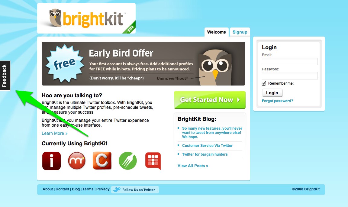
I’ve been meaning to mention a recent web design trend: the side-mounted feedback link. I think I first spotted the link on BrightKit’s site:
Now that I dig into the links, I see that they’re all powered by and link to two customer services websites: Get Satisfaction and User Voice.
The link is ‘affixed’ to the right or left edge of the browser window and usually rendered in a contrasting colour. It floats above the page–that is, it doesn’t move when you scroll the page up or down.
This lends the link considerable prominence, and I’m interested to see if this eagerness for customer feedback spreads beyond sites using Get Satisfaction and User Voice. I’m also interested to observe whether there’s any consensus on the placement of the link–right or left side? How high in the browser pane?
I’ve collected a little list of sites with side-mounted feedback links on Magnolia. I’m up to eight at the moment. Here they are:
| Site | Side | Height |
| Boagworld | Left | Medium High |
| BrightKit | Left | Medium High |
| Get Satisfaction | Right | Medium High |
| Metromix | Left | Low |
| Momversation | Right | Medium |
| Tr.im | Right | Medium |
| TweetDeck | Left | Medium |
| User Voice | Left | Medium High |
| Yammer | Left | Medium High |
Thus far, there isn’t much consensus. Obviously the high on the left side is going to get more attention than low down on the right, but there’s no standard thus far.
Improved User Experience?
I’m no user experience expert, so I’m interested in opinions of this little innovation. I’m encouraged by this apparent trend toward a more prominent call for interaction.
Of course, the feedback link is analogous to the company’s phone number. It’s how a company responds to the feedback that makes all the difference. If a company representative never replies to your concerns, it doesn’t matter how big or visible your feedback link is.
I’d also be curious about other sites that have added the side-mounted feedback link. Write a comment if you know of any.
UPDATE: I just noticed that the Book Cover Archive has a similar floating link on the left side. It’s not flush with the browser edge, though, and is a link to the site’s home page as opposed to a feedback form.

Yammer has it too. Left Medium high.
I think it’s just to get out off to the side and then have it follow the content without interrupting the user in case they need to send feedback about an option.
You don’t have to scroll all the way back up (or down) the page to leave feedback about something right? It stays out of the way too so it doesn’t get in the way of the content too.
@Brooks Thanks for that–I’ll add it.
@Brooks Weird, I don’t see it. Maybe I have to be signed in?
Yes, it appears to be only when you sign in.
Here is a screenshot. Apologies for the migraine-inducing blur: http://www.brooksduncan.com/bd/yammer.jpg
A couple of Irish sites do this too.
http://www.decisionsforheroes.com/
and
http://www.igopeople.com
IGOpeople link
IGOPeople expanded
Thanks for listing these Darren. I think it is a positive trend. I think the ability “outsource” the gathering of feedback makes it easier and is a good thing (I particularly like GetSatisfaction.com as a solution).
I don’t think it’s a good thing, from a UI perspective. Is this really the correct “weight” to give this link? As for @Tyler’s comment about not having to scroll to leave feedback – is it really that hard to scroll? We know that menus & links are at the top and/or bottom of the page. Why not put the link in one of these locations?
I just found another one nrkneta.no.
The feedback link is middle right, and when clicked it opens a lightbox-esque feedback thingy. A very strange implementation.
Hey Darren,
We recently started using GetSatisfaction for Strutta.com as well.
What I like about it is not only does it encourage more feedback, but it also airs all of that feedback publicly (We too use the lightbox widget as John describes). Especially for software startups in beta, it’s handy to both marketing and dev. It serves as proof that we’re listening.
http://getsatisfaction.com/strutta
Hi,
There are lots of other sites also like bankofamerica and delta.com which provided scrolling + sign, new window pops up once its clicked.Does any one having idea how to include it for own website.
This feature seems more like a way for getsatisfaction.com etc. to promote itself.
In particular, if you click on the “feedback” link at http://nrkbeta.no/2009/01/08/ensom-rytter-med-5d-mk-ii/ for example, you don’t get an input box to submit feedback, you get prompted with a list of other people’s feedback, and a link to a new site (at getsatsifaction.com) When you follow the link, again you do not get to enter your feedback, you get a Search box. You are now in “getsatisfaction land”.
All in all, I think it is an easy and cheap solution. Better than nothing at all, but can be improved without too much effort (for a Rails site, for example, there is a plugin http://github.com/jsboulanger/feedback).
Stephan
my account is open is shadi .com