In which I risk being a bit of a Debbie Downer.
Watching and reading coverage of the Olympics, I’ve observed a lot of projections and comparisons involving Canada’s medal haul for 2010 and previous years (the latest example was in a Slate piece by Dahlia Lithwick). I’ve a lot of graphics showing medal totals for the previous Olympics held in Canada.
It’s a rich vein for the media, and a natural one. After all, it’s a sports competitions, where achievements are measured empirically.
I got to thinking about whether those were fair comparisons to make. Surely the number of medals has grown over the past, say, 35 years. And surely the number of participating nations and athletes has grown as well. So, I did what I always do when I wonder about something. I made a chart (click for gold medal bigness):
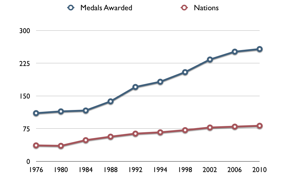
It shows the number of medals up for grabs at each Olympics, and also the number of nations participating. Interestingly, since 1976, the number of available medals and nations attending have grown at similar rates–they’re at 175% what they were. As you can see, the rate of medals has, recent years, exceeded the growth of participating nations.
And then there’s the number of athletes participating. In 1976, there were roughly 30 athletes per event. In 2010, that’s still the case.
My analysis is pretty rudimentary, but it seems like the amount of competition has stayed consistent over the past 35 years. It’s no more or less difficult to win a medal at the Olympics than it was when I was born.
What do you know? I wasn’t a Debbie Downer after all. Media folks, compare medal counts until your graphic designer cramps up.

Is the number of nations participating really reflective of anything, though? If you watched the opening ceremonies, it seemed to be a small number of 100+ or near 100 member teams, a few teams with a dozen or more members and quite a few one or two member teams. Just because Pakistan and Ghana are participating (with one athlete each) does that mean anything when it comes to competitiveness at the Olympics?
It seems to me that given there are only a handful of countries in serious contention for medals and that since the number of medals available have increased dramatically, it follows that while it might not be easier *within a specific event* to win a medal, it’s certainly become easier to win more medals overall.
Interesting that you should mention Pakistan. At the Opening Ceremonies NBC kindly provided the Population figures for the participating countries. Pakistan stood out for me with only 1 athlete out of approx 180 million people. Contrast that with Canada at approx 200 for 35 million people and there’s quite an obvious disparity between countries and their potential competitiveness. There’s something awry here with sports competitiveness worldwide and the Olympics highlights this inequality for me.
The short answer: developed nations are always going to be better than developing nations because of resource disparity.
That said, there are also cultural factors to consider. As it happens, one of my more popular old posts is about why India is bad at sports. The comments are more informative than the original post.
Forgive me if I’m missing something, but isn’t this a false correlation? I’m not sure what the growth in the number of available events has to do with the growth in countries participating, given there are likely time-related factors involved the number of events – it looks like there were quite a few new events added in the late 80s and throughout the 90s, both in new and existing categories (ie: snowboarding (6 completly new new events) and biathalon (8 new events – primarily the addition of womens’ events in the early 90s). There’s a notable increase across medal events purely from the addition of womens’ categories ).
I wonder if a more fair correlation would be to look at cultural norms around gender issues to the increase in awarded medals.
For those interested, a list of Winter events and the year they were added can be found here: http://en.wikipedia.org/wiki/Olympic_sports#Winter_Olympics
Sometimes I think you come up with blog ideas based on whether or not you you get to create an accompanying chart.
Darren. It must be really exciting having the winter olympics on in Vancouver. Your city looks beautiful. Have you attended many of the events?
bobby